Friday, November 18, 2011

Silhouette

Hey Everyone !
I have been a lazy blogger this year, my apologies.

Today I want to share my Silhouette piece artist statement with you. For this assignment, we were asked to create a work using silhouettes. The Concept Behind this piece was to show the endangerment of Society in India. The silhouettes on the left represent the ancient culture and the right side portrays what the culture has become and how the ancient culture is being endangered. The Right side silhouettes have been done in black, because it represents a dark age, a loss of culture and tradition. On the left side I have the silhouette of a man and woman dressed in traditional clothing. The woman has a clay pot on her head and is wearing her dupata as a veil as a symbol of respect. The man is wearing a turban as a symbol of respect for God. The Himalayan mountains are a symbol of strength and steadfastness. They are the point where the Ganges originate. It is said that the Ganges river is in its most pure form at this point. The temple and the sage are symbolic of ancient Vedic culture. The lotus grows in muddy waters, yet it is beautiful. This shows that humanity can rise above adversity, these are the teachings of the Vedas.

In today's modern age of materialism shown in the painting by sky scrappers, cars and people in western clothing. The once Vedic culture has become a cooperate culture, where western culture is imitated more and more. People in this modern society have no use for Vedic culture. The result of abandonment of Vedic culture is a self centered society.

This piece was created on Masonite ( 8 by 11)I chose the masonite because of it's size. I chose to work with acrylic paint, because it bright and drys quickly. Overall I am happy with the piece. It may appears slightly off balance. However this was intentional in order to show the contrast between the two societies.

Thursday, October 6, 2011

Dual Portrait

Hey, everyone !

Today I want to share a my watercolour Dual Portrait with you.


For this assignment, we were asked to create a portrait that show duality of our personalities. The main concept of my portrait is to show that the way someone portrays them self may not be, their true feelings/personality. My concept shows a girl anxious and angry, in a sensitive state of mind, however she's hiding by the tree and her silhouette, which is in the lighter portion of the picture is what others see, the exuberant, light hearted part of her.


The two sides of my personality I wanted to show are both completely opposite. The first quality I wanted to show was anxious and unhappy and the second was exuberant. I wanted to express these two side of my personality because, everyone knows I'm always happy and friendly, however I have another side of my personality, which is more sensitive and anxious . The figure which is anxious has very expressive brush strokes around her, so that we can understand her emotional state. The silhouette has soft brushstrokes that are blended together and I used light colours, to convey happiness.


The reason I chose watercolour was because it's blends well and drys fast! We were not given a lot of time and although I took a few days to come up with a concept I spent minimal time on it. Overall I like the way it turned out. Although I wish I wouldn't have messed up on taping the border.


Friday, September 16, 2011

Frida Kahlo Self-Portrait with Monkey


Self-Portrait with Monkey
1938
Oil on Masonite
16 x 12 in
Albright-Knox Art Gallery, Buffalo

Hey Everyone !
It's been a short summer, but I feel like a haven't done this for an eternity !
I hope everyone had a good summer? Year four CyberArts has began! I can not believe it, time flies. To start off the year we have been doing some drawing, focusing on light and shadow with different materials. We did some quick fabric drawings and now we're moving on to portraits. So today I will looking at a famous portrait by Frida Kahlo.

Background on Kahlo
Frida Kahlo had polio when she was a child, which made her right foot immobilized. She was given the cruel nickname “Peg-leg Frida” which made her sensitive about this deformity. Frida suffered from another accident later on in her adolescence, she suffered severe injuries and was bedridden for several months. During this period she began painting, as a distraction from pain and boredom. She used a mirror, so that she could serve as her own model, and this is why she has painted several self-portraits. (Link)

About the Painting
I chose this painting because it reflects Kahlo's personality. She depicted her self looking very serious, with attention to her thick eyebrows her trademark feature. She's wearing a traditional Mexican necklace, and her hair is tied up elegantly. In the background there are thick and over sized trees and leaves. I read she loved gardening and animals, they helped distract her from her loneliness. I especially like the monkey's eyes, they are mysterious and my favourite part of the painting.

Critique
The paintings is in a pyramid composition, which is Kahlo trademark. The texture of the monkeys hair and the hairy leaves unify the painting. The organic lines direct the eye up and down the painting, creating movement and harmony. Overall the use of earth tones, organic lines and thick texture, creates balance and combined together make a visually appealing painting.

Saturday, June 11, 2011

Digital Circlism


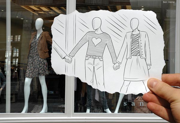
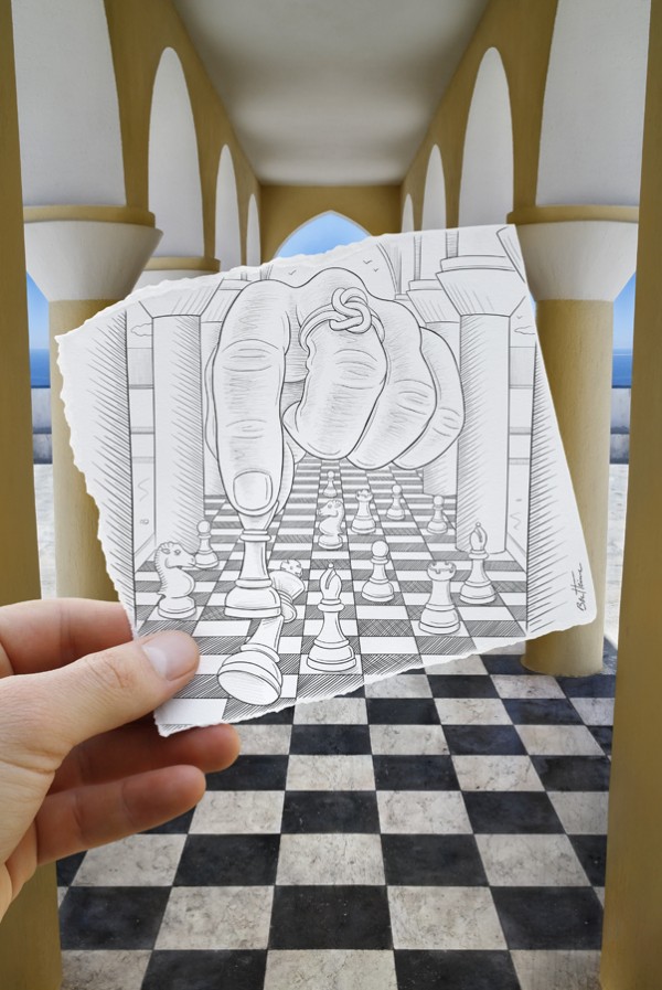
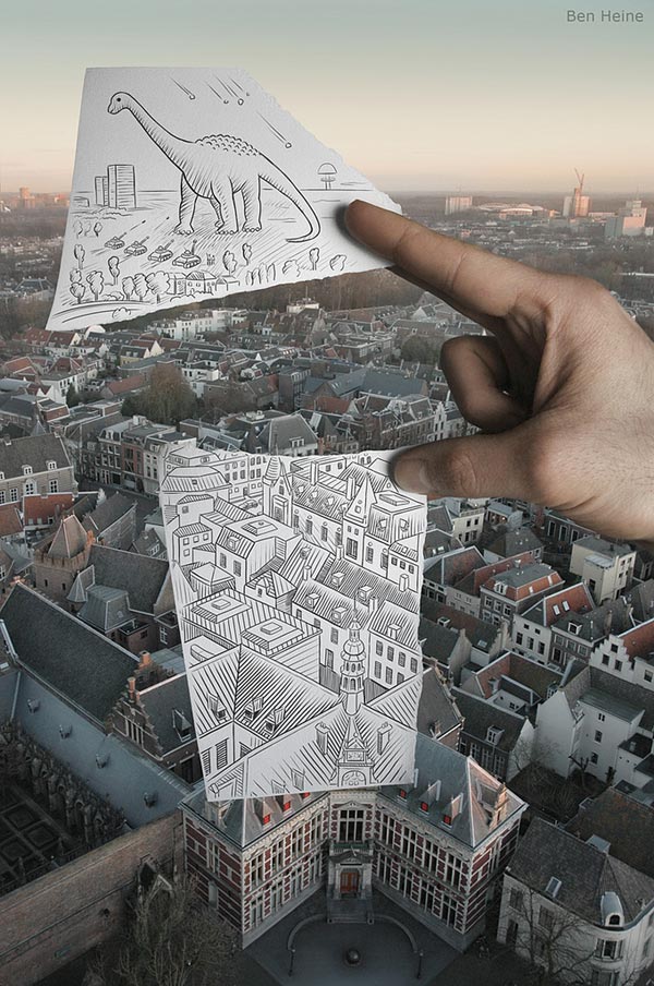
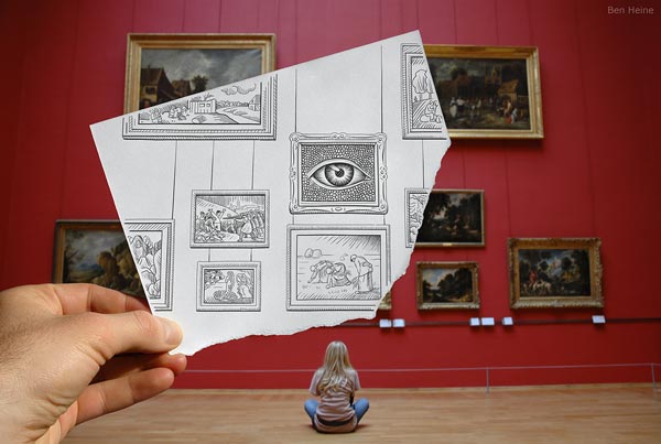
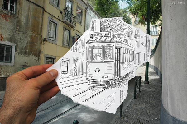
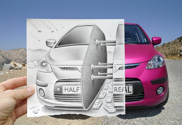
What is Digital Circlism ? This is a modern artistic expression, a mix between Pop Art and Pointillism. It is made with digital tools says Ben Heine.

Ben Heine

Hey everyone ! =)
Hope your saturday morning is going well ?
Today I'm sharing about an artist I recently came across which, intrigued me. I have been looking at a lot of photography as you may know, But this is something I have never seen before!
Ben Heine is
a
prominently self-taught artist in drawing and photography. Although he briefly studied painting and sculpture. He also has a degree in journalism. For the past 8 years he has worked as professional graphic creator.He is the inventor of "Pencil Vs Camera" and "Digital Circlism" . I thinks his work is amazing. At first the images appeared to me at they were done in photoshop. Then I read that Ben does the photography himself along with the illustrations !
This art is very interesting and I especially liked that his work incorporated photography along with drawing. To see more of this work click on the links above(^).


Wednesday, June 8, 2011

GABRIEL MORENO


Hello everyone! I just wanted to quickly share a really cool artist I came across.
Gabriel Moreno works with such basic materials: a pen and a brush.
However his illustrations are brilliant !

How does he do it ?
He begins in black and white, adding layers of color and images of other places and people "tattooed" into their skin. Flowers, birds, and faces organically expand from his subjects, as if a rush of creativity, or a dream, is escaping them.

His work is truly inspirational and unique. I encourage everyone to take the time and take a look at his work.

Sunday, June 5, 2011

Down by the Lake

Today is a bright and sunny Sunday, so I went out today to take photographs for my photography assignment ! I took two really cool pictures of the water and the sunlight's reflection on the water. I just couldn't help myself from sharing them with you ! I know that recently all of my post are focused of photography, but it's because super excited about photography !


Well enjoy the rest of the day and the beautiful weather !

Saturday, June 4, 2011

Tall Painting

Hey guys! Look what I found ..
This video is really interesting, in the video a "tall painting is created".
It's fascinating the way they pour the paints, one by one. I found the ones on the wall previously made, very cool as well and can only imagine how this one may turn out. I can't believe how flawless they are and how easy they make it look. I'm sure it's not as easy as it looks. Check it out it's something unique that I have never come across before!

Thursday, June 2, 2011

Photography


Hi everyone!
I was out yesterday with some friends, taking photos and I had a great time. I'm still learning but this was a fun experience. We went to an old Burger Place which had been abandoned. Discovered by my friend. I just wanted to share, the photos I took! I would really appreciate some feedback on how I can improve!


[Please don't trespass to take photographs ! My friends and I had permission =) ]

Saturday, May 28, 2011

Dominic Boudreault

Dominic Boudreault is from Quebec, Canada, he's a Motion Photographer.
He is constantly "in motion " in search of a perspective that will transmit both the beauty and the speed of the world in which we live in.
 He devotes his time to transpose his vision into images and he's dedicated to make the necessary efforts for his vision to become a reality. 
His photography is simply breathtaking. I particularly like his landscapes!

Sunset from the top of Mont-&<span class=

Waterfall - &<span class=

Dominic's The City Limits - Timelapse is simply amazing. It took Dominic over a year of his free time to make the video. His goal was to show the quality between the city and nature. All the locations which include; Montreal, Quebec, Toronto, Manhattan, New York and Chicago, were carefully picked by him and researched ahead of time.

I really found this very interesting and I am thinking of attempting something like this in my culminating assignment, I similarly would like to show the flow of traffic . I'll keep everyone posted on how it goes!


Thursday, May 26, 2011

Developing negatives in The Dark Room

I'm so excited to share, my experience with everyone !
Today for the very first time I learned how to develop negatives in the dark room at my school. Thanks Miss =) It was amazing I got to learn how use all the fancy equipment, and I placed the picture in the developer, fixer, stop, bath and dried the image in the dryer myself !
I simply cannot explain the magical feeling, when I saw the picture develop before my own eyes !!
It felt like I was at Disney World again !!!


Wednesday, May 25, 2011

A beginners picture taking adventure !


My group ( Roshni, Payal and Stephen) and I recently went out and took some pictures. So that we could get a better understanding of aperture, ISO, shutter speed etc..
It maybe helpful to you, and help you understand what to do and what not to do, by taking a look at our photographs !
there the link ..

And if your like mea beginner and still confused about , the basic concepts of photography, check out this site it explain the relationship between :the ISo, aperture and shutter speed.


Friday, May 20, 2011

Edward Burtynsky


We started photography YAAY !!! During this unit we will be taking photos of industrial areas and nature's best scenes. Putting them together to make a presentation. So, first thing was, we went over some, basics like aperture, ISO and F-stops, which I found confusing, because this is my first time with all this. Then recently we watched a movie : Manufactured Landscapes, in which (Canadian) Photographer, Edward Burtynsky travels the world observing changes in landscapes/the environment due to industrial work and manufacturing.


The movie focuses on Burtynsky photographing industrial landscapes i.e factories, landfills and expanding industries. The movie really tries to show the shocking reality, that the western world is ignorant of. For example exploitation of workers, the movie shows how the ill treated workers, slave away for hours, in terrible working conditions to make a small wage. It focusses on the effects of globalization on the environment, natural landscapes around the world.


This video was a rude awakening for me, I had no idea that, somethings like our cell phones and computers caused so much e-waste and that poverty stricken people across the world had to sort through it with no protective equipment, putting themselves at risk of disease. The thing that really hit home, was the image of children playing in the e-waste!


Just like our projects the movie had incorporated visuals with sound. There were scenes in which a narrator spoke, then, there was other sound (natural). There was also an interesting use of still images, as well as film in motion. There were still images taken by Burtynsky, the actual film footage with the director and Burtynsky speaking and footage with sounds of machines,workers, tools etc... despite all these uses of mixed media, there was unification through out the video.


Personally, this film was interesting but, I had a difficult time staying focused. Burtynsky's photography and his process was intriguing. The Photographs were all extremely meaningfull, with hidden messages and layers of meaning. What I liked was that Burtynsky didn't want the viewer to have a particular perception by looking at the picture, nor did he try to create a bias with his art.


"Nature transformed through industry is a predominant theme in my work."- Edward Burtynsky


Take a look at his work, it's unique and one of a kind, I have linked his site above^.

Wednesday, April 20, 2011

Mon Chaise !


So, what comes to mind, when you take a look at my chair?

Comfortable and stylish I hope!

For this assignment we were asked to design a chair that exuded our personality, something functional and professional. Before I began my concept sketches I had a few words in mind while designing my chair: Comfort, style and leisure. I wanted my chair to be beautiful, but comfortable.

I used foam Core and paper, to make my maquette. Which made this assignment both difficult and interesting! The level of difficulty in this assignment was at a whole new level because, the concept sketches had to be proportionate, as well as the orthographic and isometric sketches. This was the first time I considered proportion and it was a good learning experience. I also had difficulties making all the pieces of my chair, this was the first time I used foam core to make something 3D which is not made of squares and rectangles.

Orthographic Designs


Here I have my orthographic sketches of my chair: The Front View, The Side View and The Top View.

Sitting in the chair, you can cross your legs, curl up in a ball, stretch out comfortably or sit up straight. There are large arm rests, which are upholstered, so you can comfortably rest your elbows. The backrest in upholstered using the ortho support system, so that it's not too soft nor too firm. I decided to make the chair like an armchair that's been altered so that, it's multi functional. The chair is multi functional, because it would come in two models: The first model would have the base and frame made of Mahogany wood. The second model would have either iron/stainless steel base and frame and would have the option of pleather upholstery. I consider my chair design, a piece of art because, It is esthetically beautiful to look at and is function, it can be placed in any setting and still look stunning and I sincerely believe art should be functional and look amazing any where! The base of the chair is curvy and has swirls leading the eye from the seat to the backrest. The backrest is in a form of a curve, which leads the eye up and down the chair.

Isometric Drawing
This is my Isometric drawing, I have included a girl in the image to help the viewer understand, the proportions of the chair.

The million dollar question; How does it exude my personality?
From the picture and sketches you can easily, see that it's very curvy and "cushiony", a little like myself. Comfort is the first thing I look for In a chair! My chair is made of many intricate pieces, which are one of a kind, like my difficult to understand, personality. In the first model, the Mahogany wood represents my down to earth nature and how I prefer things to be natural as well as my deep respect and love for tradition, the second model, which is chic and modernistic shows that I am also very modern and I like contemporary pieces.


Monday, April 11, 2011

Interesting Logos


Hi everyone, have you seen this popular Logo before ?
If you have, do you know what is so special about it ?

Often it's the popular logos which, we don't seem to give a second thought to.
For example if you look at the center of the Tostitos logo, you can see two people eating a Tostito chip with a bowl of salsa. This logo communicates the main idea of the company and it's product.
Everyone talks about the FedEx logo with the arrow, and last year in Year 2 CyberArts my teacher even showed us in class as a part of our typography unit. But it's not that easy to spot. So here is an image where you can clearly see the arrow.


The cool part about this logo is that, he pink parts of the BR forms the number 31, in referenc

e to the 31 flavors the company offers. (now thats a great way to convey, a message to your consumers)


At first, this logo might not make much sense. But if you look closely, you'll see the number 1 in the negative space between the F and the red stripes. It's difficult to stop, but what an amazing, how thoughtful of the designer!


Make sure to keep a watch out, you'll never guess what you'll find !

Happy Exploring !