Thursday, June 17, 2010

ArcSoft ShowBiz® DVD 2


look what I found.!


ArcSoft ShowBiz® DVD 2 is a simple yet powerful software application that has everything you need to edit home videos and create professional looking DVDs. The software features a simple storyboard view for basic video sequencing and a more advanced timeline view giving you greater control over your movie clips, audio tracks, and transitional effects. What's more, the program includes a powerful photo slide show wizard and a full set of DVD authoring tools for turning your video productions into great-looking DVDs ready for enjoying on TV.

The program lets you assemble photos and videos onto the "Storyboard," then combines everything together and puts your final movie on DVD

Video sequencing is the foundation of every video story. Video sequencing is a scene broken down to a short clip, while still delivering the same message. Instead of a 4 minute video of a person parking the car, it would be a 10 second video. In addition to Video sequencing you can add special effects, animated text, ongoing commentary and music.

Other Technologies offered by Arcsoft:

Definitely check this out !

Thomas Kinkade


Thomas Kinkade, America's most collected living artist, is known as "Painter of Light". The left handed painter from California, emphasizes simple pleasures and inspirational messages through his paintings. A devout Christian, Kinkade says he gains his inspiration from his religious belief. His goal as an artist is to touch people of all faiths, and to bring peace and joy into their lives through the images he creates.


Wanted to share with you all, the famous 'Rain' paintings by Kinkade which I received through E-Mail.

Stop at the picture for a second, and watch the Rain...


We all wish we could paint like Thomas Kinkade so below are guidelines I found on the internet that shows his style and technique.
The sixteen guidelines for creating the "The Thomas Kinkade Look".
1) Dodge corners or create darkening towards edge of image for "cozy" look. This may only apply to still imagery, but is useful where applicable.
2) Color key each scene to create mood, and color variation. When possible, utilize cooler tones to suggest somber moods, and warmer, more vibrant tones to suggest festive atmosphere. In general, create a color scheme for each scene that can be accentuated through filtering, DI treatments, or through lighting. Most of my paintings feature an overall cool color envelope, into which warm accents are applied.
3) Create classic compositions. Paintings generally utilize a theme and variation compositional motif. Heavy weighting of the image towards one side, with accented areas of interest balancing it on the other side. Allow the eye to wander into the scene through some entry point. Be aware of where the viewer is standing at all times. Utilize traditional eye levels for setting the shot -- that is, no high vantage points, off-kilter vantage points, or "worms eye view" vantage points. Generally focus on a standing adults viewpoint of the scene at hand.
4) Awareness of edges. Create an overall sense of soft edges, strive for a "Barry Lyndon" look. Star filters used sparingly, but an overall "gauzy" look preferable to hard edge realism.
5) Overall concept of light. Each scene should feature dramatic sources of soft light. Dappled light patches are always a positive, glowing windows, lightposts, and other romantic lighting touches will accentuate the overall effect of the theme of light.
6) Hidden details whenever possible, References to my children (from youngest to oldest as follows): Evie, Winsor, Chandler and Merritt. References to my anniversary date, the number 52, the number 82, and the number 5282 (for fun, notice how many times this appears in my major published works). Hidden N's throughout -- preferably thirty N's, commemorating one N for each year since the events happened.
7) Overall sense of stillness. Emphasize gentle camera moves, slow dissolves, and still camera shots. A sense of gradual pacing. Even quick cut-away shots can slightly dissolve.
8) Atmospheric effects. Whenever possible utilize sunset, sunrise, rainy days, mistiness -- any transitory effect of nature that bespeaks luminous coloration or a sense of softness.
9) A sense of space. My paintings feature both intimate spaces and dramatic deep space effects. We should strive for intimate scenes to be balanced by deeper establishing shots. (I know this particular one is self-evident, but I am reminded of it as I see the pacing of the depth of field in Kubrick's "Barry Lyndon".)
10) Short focal length. In general, I love a focal plane that favors the center of interest, and allows mid-distance and distant areas to remain blurry. Recommend "stopping down" to shorten focal lengths.
11) Hidden spaces. My paintings always feature trails that dissolve into mysterious areas, patches of light that lead the eye around corners, pathways, open gates, etc. The more we can feature these devices to lead the eye into mysterious spaces, the better.
12) Surprise details. Suggest a few "inside references" that are unique to this production. Small details that I can mention in interviews that stimulate second or third viewings -- for example, a "teddy bear mascot" for the movie that appears occasionally in shots. This is a fun process to pursue, and most movies I'm aware of normally have hidden "inside references". In the realm of fine art we refer to this as "second reading, third reading, etc." A still image attracts the viewer with an overall impact, then reveals smaller details upon further study.
13) Mood is supreme. Every decision made as to the visual look of each shot should include the concept of mood. Music can accentuate this, use of edges can accentuate this, atmospheric effects accentuate this, etc.
14) The concept of beauty. I get rid of the "ugly parts" in my paintings. It would be nice to utilize this concept as much as possible. Favor shots that feature older buildings, ramshackle, careworn structures and vehicles, and a general sense of homespun simplicity and reliance on beautiful settings.
15) Nostalgia. My paintings routinely blend timeframes. This is not only okay, but tends to create a more timeless look. Vintage cars (30's, 40's, 50's, 60's etc) can be featured along with 70's era cars. Older buildings are favorable. Avoid anything that looks contemporary -- shopping centers, contemporary storefronts, etc. Also, I prefer to avoid anything that is shiny. Our vintage vehicles, though often times are cherished by their owners and kept spic-n-span should be "dirtied up" a bit for the shoot. Placerville was and is a somewhat shabby place, and most vehicles, people, etc bear traces of dust, sawdust, and the remnants of country living. There are many dirt roads, muddy lanes, etc., and in general the place has a tumbled down, well-worn look.
16) Most important concept of all -- THE CONCEPT OF LOVE. Perhaps we could make large posters that simply say "Love this movie" and post them about. I pour a lot of love into each painting, and sense that our crew has a genuine affection for this proje
ct. This starts with Michael Campus as a Director who feels great love towards this project, and should filter down through the ranks. Remember: "Every scene is the best scene."
The list above is not all-inclusive, but is a good starting point for internal dialogue. These guidelines are not listed in order of importance, but are dictated off the top of my head. After painting for nearly 40 years, I still wake up every morning daydreaming about new ways to make paintings. Creating a movie is a natural extension of the picture making process, and hopefully my catalog of visual paintings, along with my visual guidelines in this memo will provoke dialogue, experimentation, and a sense of over-arching visual purpose.
By Thomas Kinkade.

Saturday, June 12, 2010

Wild Ocean


I saw this today on an IMAX screen, it was a pretty cool piece, it had nice visuals that worked well. There were some nice shots flying over coast line which were very exciting, and lots of footage of schoals of sardines and their predators, it was nice to see dolphins, whales and other animals on a huge screen in 3D. The documentary was about the natural food chain of the ocean and how it has been disrupted in many places by human fishing. This focused on the sea around South Africa where the food chain is still intact like it used to be elsewhere. It also showed a fair bit of fisherman and other people of the area which was just as interesting as the amazing land/sea shots. It spoke about how we need to protect the delicate balance of the food chain. It also had quite nice accompanying music.


Each year an unbelievable feeding frenzy takes place in the oceans of South Africa as billions of sardines migrate up the KwaZulu-Natal Coast. The migration has provided an annual food source for both life in the sea and the people living along the African shores for countless generations. The film demonstrates how business, government, and the local people have joined forces to protect this invaluable ecological resource. "Wild Ocean" will delve audiences into an epic underwater struggle for survival and reveal the economic and cultural impact the migration has on the coastal communities.


This nature documentary traces the volatile events of the annual sardine migration through the KwaZulu-Natal Wild Coast off of South Africa. As massive schools of the fish move through the ocean like living black clouds, they attract the attention of dive-bombing Cape Gannets, Cape Fur Seals, and Common and Bottlenose Dolphins, as well as Blacktip, Copper Head, and Dusky Sharks. Also on the scene are massive Humpback Whales, who feed off of the plankton that live in abundance off of the coast. Wild Ocean is a dazzling assembly of breathtaking underwater and aerial cinematography that captures the exquisite beauty of the Wild Coast in the kind of ultra-fine detail that only IMAX can deliver.

Wild Ocean's awe-inspiring shots of the South African coast and stunning underwater cinematography are allowed to speak for themselves. The natural beauty of sweeping vistas and the primal but elegant behavior of aquatic animals are the stars of the show. Highlights of the program include the slow and stately movements of grizzled, barnacled Humpback Whales, a shark feeding frenzy, and the surreal sight of flocks of Cape Gannets zipping downward through the water like missiles as they plunge-dive the schools of sardines, striking the water at incredibly high speeds. We also get a glimpse of local fishermen—who rely on the sardine migration for survival—casting their nets into the teeming water. If Wild Ocean has a flaw it's that, like most IMAX features, its 40-minute running time leaves you wanting more.

Wild Ocean was shot by veteran IMAX cinematographer Reed Smoot. His beautiful work is captured in high style by the 1080p/VC-1 transfer on this Blu-ray. Detail is spectacular throughout the feature, rivalling the crisp imagery of high-definition digital video without sacrificing any of the warmth and character of celluloid. Colors are bold and accurate. The image is free of digital artifacts. The only limitation is by the large and unwieldy IMAX cameras, the show is constructed of the sort of long, stately wide shots so common in IMAX that they've almost become the visual cliché. But each and every frame of the movie is so packed with beauty, that visual aesthetic is hardly a problem.


Monday, May 31, 2010

Luminato

Hey Guys, this is something I stubbled upon and I thought I would share it with you.


Luminato (International Festival of Arts + Creativity) is a federally registered charitable organization dedicated to celebrating the creative spirit by showcasing excellence in the arts and partnerships with new artists.

Now in its fourth year, Luminato is an annual ten-day celebration of the arts where Toronto's stages, streets, and public spaces are infused with theatre, dance, classical and contemporary music, film, literature, visual arts, and design. This year it’s in June.

Luminato embraces three key programming principles: collaboration, accessibility, and diversity.

Luminato embraces artistic collaboration - creating unforgettable moments by bringing together artists from different cultures and genres. The festival encourages local, national, and international artists to discover unprecedented creative expressions through unexpected partnerships


Luminato's hallmarks include free widely accessible events, and "accidental encounters with art." Festival-goers are invited to participate, explore, and celebrate their own creative spirit.

Luminato embraces and celebrates Toronto's cultural diversity, and recognizes that creativity flourishes when cultures join together in a spirit of tolerance and respect.

Luminato is proud to partner with selected schools and specialty programs in underserved communities and neighbourhoods - offering students from grades K-12 experiential workshops, artist in- the-school visits, presentations and discussions. These programs are designed to encourage interactive participation and meaningful engagement with the Festival programming and themes, while providing enrichment and connections to the classroom curriculum. More information will be coming soon. For more information, contact: education@luminato.com

To attend any of these Luminato events just go to the website and click on attending Luminato.


Tuesday, May 25, 2010

Promotional Website for The Bak Up Plan


This website design is simply brilliant!!! The site is designed like a street from the movie and when you move the cursor past the stores, the lights flicker on and off, and as you move the cursor the dog from the movie walks. Now that's cool.
The design is incredibly clever each store on the street is a sub page. For example the art gallery is a sub page of the pictures from the movie.


I think It's amazing how real the Stores look! it's a 3D image of the book store window that catches everyone's attention. The attention to detail on the moped and the paintings inside the art gallery, the posters on the book store window all make it look very authentic.


The navigation of The site is incredibly efficient and user friendly.
The site is visually pleasing and I'm very impressed with the balance between the animated elements and real photographs of the site. I'm looking forward to making my own site and I hope it's half as good as this.


The Back Up Plan


I recently watched The Back Up Plan and the while the movie it self was a great, the beginning really caught my attention. The beginning is animated and it's really cool! While the beginning credits role, the animation begins. I don't want to spoil the story, but in the movie Zoe really badly wants to have a baby. So In the animation everywhere she looks she relates it to baby stuff. She sees a couple drinking wine and it shows her looks at them drinking baby bottles it's so cool. The cabs on the street turn into big yellow ducks, the subways starts t look like a chu chu train every thing around her turns babyafied including the city streets.

Friday, May 21, 2010

Karim Rashid


What an inspiration, this is what I want to do in the future! I want to create an impact as large as Karim !


Karim Rashid is one of the most productive , designers of his generation. Over 3000 designs in production, over 300 awards and working in over 35 countries attest to Karim's legend of design. His award winning designs include democratic objects such as the ubiquitous Garbo waste can and Oh Chair for Umbra, interiors such as the Morimoto restaurant, Philadelphia and Semiramis hotel, Athens and exhibitions for Deutsche Bank and Audi. Karim has collaborated with clients to create democratic design for Method and Dirt Devil, furniture for Artemide and Magis, brand identity for Citibank and Hyundai, high tech products for LaCie and Samsung, and luxury goods for Veuve Clicquot and Swarovski, to name a few. Karim's work is featured in 20 permanent collections and he exhibits art in galleries world wide. Karim is a perennial winner of the Red Dot award, Chicago Athenaeum Good Design award, I.D. Magazine Annual Design Review, IDSA Industrial Design Excellence award.


He holds honorary doctorates from the Ontario college of Art & Design and Corcoran College of Art & Design. Karim is a frequent guest lecturer at universities and conferences globally disseminating the importance of design in everyday life. Karim's has been featured in magazine and books including Time, Financial Times, NY Times, Esquire, GQ and countless more. In 2009 Rizzoli released Karim's latest monograph KarimSpace, featuring 36 of Karim's interior architecture designs. Other books include Karim's guide to living, 'Design Your Self' (Harper Collins, 2006), 'Digipop', a digital exploration of computer graphics (Taschen, 2005), compact portfolio published by Chronicle Books (2004), as well as two monographs titled 'Evolution' (Universe, 2004) and 'I Want to Change the World' (Rizzoli, 2001). In his spare time Karim's pluralism flirts with DJing, art and fashion and is determined to creatively touch every aspect of our physical landscape


I found his designs very inspiring, bold & beautiful. Check them out!


Thursday, May 20, 2010

Back in the Day ...


My Mom, cousin and I were talking about how animations have become so advanced and technical now and how simple but cool they were back in the day and I think we talked about this in art class but anyways. My cousin was telling me all about this and I thought I would Google it, because in todays world we rely on our technology and have forgotten about the good old days!


The praxinoscope was an animation device, the successor to the zoetrope. The praxinoscope improved on the zoetrope by replacing its narrow viewing slits with an inner circle of mirrors, placed so that the reflections of the pictures appeared more or less stationary in position as the wheel turned.

Someone looking in the mirrors would therefore see a rapid succession of images producing the illusion of motion, with a brighter and less distorted picture than the zoetrope offered.


How it works:

A band of pictures is placed inside a shallow outer cylinder, so that each picture is reflected by the inner set of mirrors. The number of mirrors is equal to the number of pictures, and the images of the pictures are viewed in the mirrors. When the outer cylinder rotates, the quick succession of reflected pictures gives the illusion of a moving picture.

What became of it:

Using this principle, Reynaud found a way to project the series of pictures onto a screen. He called this the "Theatre Optique." A standard praxinoscope, like the one above, can only accomodate a second or two of animation because of the limited number of pictures it contains. Reynaud's "Theatre Optique" used a long roll of paper to increase the number of pictures, and was therefore able to create a much longer show for an audience.


So here's a thought stop and smell the flowers !

Thursday, May 6, 2010

Website Cirtique The DO's and Don'ts

Ever go on a website and just get thrown off by how busy the page is ? Have you ever just left a web page because of it's annoying flashy advertisements or flashy/loud colour scheme? All this bugged me, but I never knew why? When I learned the 10 Principles of Effective Web Design, I began to understand. There are some key elements that make a website appealing and unappealing for the user. Through this critique I will explain a few key factors that make a website successful and unsuccessful.


A good example of a website design that isn't very visually pleasing is msn.com, Although there is a good use of negative space and white space, there are way too many buttons and lists. (it's a little to much to take in all at once) The advertising is in the smack dab middle of the page, this attracts the attention away from the side news feed. If it's your first time on the site it can be a little confusing. At the top left hand corner there is a MSN logo, and beside it is a search box. On the right side there are three large icons for: hotmail, messenger and my msn and above that a bunch of options for your search. Everyone knows the msn logo because it's very popular, but if I didn't know what msn was, I don't think I would stick around much longer. Below that there are like a zillion options: autos, entertainment etc, for the latest news. Directly underneath that on the left is a list of the top stories and in the center there is a a large advertisement with these large letters popping out! It's extremely overwhelming and frustrating to navigate around the site. It's hard for the brain to understand and process, which area of the site you want to visit. It's difficult to remain patient because of the complicated layout of the site, the worst part is that all the information advertisements and the search engine are all crammed together. Once you vistit the site several times it tends to get a little less confusing.


Now here is an example of a site that is slightly more effective and visually pleasing

This website is great example of an effective use of the principals of web design. As soon as you arrive it's self-explanatory. The most brilliant thing about this site is that is has been designed in a Z pattern with the most important content in the top right and left corners and in the bottom left corner.(this makes it easy for the visitor to quickly scan for what they are looking for) Upon entering the site, On the left hand corner the logo appears in a clear white font, on the right hand side there are three simple categories: about, client list and content, In the center is a large image of a piece of art work by the artist, on the bottom left, to side of the image is a brief description of the art work, on the very bottom on the site there are three categories once again (if you move your mouse to the bottom of the screen a gallery appears). The site has used the space very well. I like the format it's easy to scan through the site. It's completely user friendly, the information is easy to access, the font is clear and easy to read and I like the way the background is black and the font is white, the two colours contrast well together and it looks smart and professional.

I hope that this will help you, when you are designing a website for your self, or even when you are designing a blog, or an advertisement or even something else, you can take into consideration the Do's and Don'ts of web design.

Wednesday, May 5, 2010

Art Deco Artist - Arthur Radebaugh

So I had to do ALOT of research before I started my self portrait assignment and this something I came across during my research..

Illustrator, Arthur Radebaugh's (1906-1974), ultra futuristic depictions of vehicles in the 1930s are well respected in the genre, however, there is actually very little known about the artist himself.

His vision of the future was heavily influenced by the Art Deco movement - check out his use of vivid colours, geometric patterns, sweeping curves and streamlined design - it's classic Art Deco Style.


He described his works as "halfway between science fiction and designs for modern living."

He could easily be considered a 'concept car' designer by today's automobile design standards.

I love his sense of aesthetic - his depictions are incredibly moody, a bit dark and apocalyptic, but juxtaposed with a more promising, hopeful sense of the future.

And I especially love the sleek, sexy lines, so indicative of the Art Deco style.


Sunday, May 2, 2010

Spring Fashions


As I mentined in my last post, spring has already arrived, not that I'm complaining... Oneof the reasons is spring is like a breath of fresh warmair after winter, not only is it bright and full of life outside, it shows this in the spring fashions. The city of Toronto has come to life this spring, with bright colours. This season has bold and bright purples, vivid lilacs, parrot greens and deep turquoises, all of which can be found on silks, chiffon's and shiny
satins. The clothes look rich and vibrant, even the accessories are bright. Reds, pinks, blues, greens and purple off course! The print designs on the clothes are derived from nature this spring, peacock feathers, leapord prints and flowy graphic tees and loose comfortable shirts with pockets.

Nothing says spring like something floral and floaty
. From printed blouses to graphic tees.
A.P.C Madras Grape Print Sleeveless Top
Lauren Moshi Gun Rose Pocket Tunic

I'm loving the bold handbags this season! They're a great accessory and a fun way to add a punch of colour to your outfit !


By Devi Kroell

By Valentino
By Marc Jacobs


Hope this helps you kick start your spring season shopping!

Friday, April 23, 2010

Spring is Here !!!

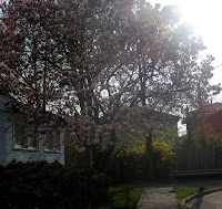
Look around you, the trees have new buds and the flowers are blooming, you're going to be waking up in the morning to the sound of birds chirping and that nice weather you're experiencing is here to stay. What do all those signs point at? They point at the arrival of Spring! I absolutely love Spring, and I always look forward to the arrival of the flowers of the Magnolia tree. They simply put a smile on my face! They make everything seem so beautiful and perfect after a boring grey Canadian winter. Well, this year I didn't experience the typical "harsh Canadian winter". Perhaps that's why I wasn't awaiting the Magnolia trees as usual. Life was just life, on this "normal" Thursday. As usual getting up late in the morning, wishing I could just go back to sleep, jumping into the shower, running off to school, dragging the day out, counting down the seconds, awaiting the bell and then hopping in the car so I could finally get home! Usually I make small talk and /or zone out on the ride home, that day I did both suddenly we had reached the end of my street, but there was something unusual! Then it hit me, at the end of the street there the Magnolia tree covered with lots and lots of beautiful pink flowers! Spring had arrived and so have the beautiful flowers of the Magnolia tree! The flowers are like nature's most perfect design, they're petals come in an organic oval shape, the flowers have lots and lots of petals. The most amazing thing was how every petal appeared the same, but after taking a closer look each petal was unique, each petal curved differently and each had a slightly different colour gradient,
but all together they make the flower look so unified and perfect.( kind of like how all of my friends and I are different; because of the way we think, look and how we are all very different from one another, but together we are like these individual petals uniting to create a beautiful flower) The flowers come naturally in a perfect tone of white, violet and rosy pink. On the weekend I saw Magnolia trees with flowers whiter than snow, and I also saw a yellow Magnolia( kind of unusual), it was beautiful. They're natural beauty have inspired me to take the time and observe nature and all it has to offer. I am incredibly sad that these flowers are only here to stay for a few weeks, but they have impacted me in such an unforgettable way that memory will always stay in my heart. I shall be waiting for my magnolias' long after spring has gone.

I forgot to mention, I took these pictures ! Weird eh, I don't usually take pictures, I guess that Thursday wasn't so normal after all...


Tuesday, April 20, 2010

Siddhagiri Wax Museum


In case you have not seen it before...

Siddhagiri Museum[similar to Madame Tussauds wax museum]


Siddhagiri Museum[similar to Madame Tussauds wax museum]
Siddhagiri Museum is located near Kolhapur city in Maharastra State , India . It has a history of more than 1000 years, and is a holy place of worship of Lord Mahadeva. The surrounding around the museum is very calm and quiet, a hilly place with a good collection of Flora and Fauna.The main objective of the project is to refresh the history of self sufficient village life. There were 12 main profession based casts i.e. professions performed by generation by family members and 18 ALUTEDARS, who provided equipments to all villagers useful in their day-to-day necessities of domestic as well as agricultural life. The first phase of the museum spans over 7 Acres of area with almost 80 main scenes and around 300 wax statues. There is a unique combination of expression, accuracy and liveliness in the whole village. Each sculpture has a multi dimensional effect and lifestyle theme to make a proper visual story.The Museum projects the entire village as a single family, and as single family members in a joint family. No adulteration, no cut throat practice, no mad rat race, no pollution, but caring, and delightful atmosphere, no bitter feeling, but fertile land, clean water, clean air, quality food, maximum use of natural resources, cattle field, livestock, job satisfaction. All these things are reflecting the beauty, joy, satisfaction of human race and one-ness with nature.
Here are some more scenes ..


Love the clarity and color, its so vivid, definitely a place I shall visit in the future.

Sprokets film festival

Today, all the CyberArts students took a trip to the Sprockets Film Festival in downtown Toronto. In the morning, we watched a variety of short films made by Canadian Students. These films were all very different from one another, they were all from different genres and made using different techniques(mediums). The Freshwater Plague, was like a documentary about the invasion of shadflies also known as mayflies in North Bay, while On the Bus was about a young man who lived in a fantasy world, far from reality and his fears of acceptance( it was like a fictional film). Bonefeather was a funny film about two male birds trying to impress a female bird(animation).

(On the Bus)


We got a chance to talk to a few of the film makers and screenplay writers, it was very interesting to learn about film school, their experiences in film school and their experiences of making the films. It was nice of them to share personal stories with us. They also gave us advice. It also was intriguing to see the different paths they have taken and it really helped me distinguish the difference between what film making is and film school is and the reality of it.

('U')

In the afternoon we watched an animated french film called 'U'. 'U' a movie about a princess "Mona"(who is a dog) and her friend "U", a unicorn. U introduces Mona to Lazare and his family the "Yeah Yeahs"(a bunch of musicians), Mona falls in love with a cat from that family, who plays the guitar. U gets worried that Mona will find true happiness with someone else and will no longer need her. Then U starts to shrink because Mona is all grown up, has found happiness and is in love.(that's all I can remember) 'U' is very different from the animated movies I have seen from Hollywood. Most of the animated movies I have watched are for children and were mostly fairy tales or movies with morals. 'U' seems to be for a more older, more mature audience and deals with mature subject matter, Unless the children in France are exposed to kissing and nudity at a very young age. Although it did contain a magical aspect, witch is common in animated Hollywood(Disney) movies.

('U')

I really enjoyed myself today, I especially liked the birds from Bonefeather, I'm not entirely sure how they were made, but they were bright, vibrant and visually pleasing. I would really like to know how the film was made and how long it took?They really did a good job of tying the film together with the story and the sound

After watching the morning films, when we were chatting with the filmmakers, the producer of The Freshwater Plague, shared with us how he made his film. He told us that he basically made his film with microphones that were lent to him or he rented them from a small musical group in his town and he shot the footage with his dad's camcorder, I found this extremely interesting and cool.

I had a great time at the Sprockets Film Festival, If you get a chance definitely check it out!

Friday, April 16, 2010

Flash CS4 Tutorial: How To Motion Tween

Hey Guys,
I wish I would have discovered this a few weeks ago, when I was struggling to deal with the change from using Flash mx to Flash CS4! I just discovered something very useful this video is great ! It shows you how to create a motion tween in Flash CS4, if you're new to Flash or have used an older version in the past. This video is extremely helpful (in case your new to Flash it shows you how to create a symbol, a motion tween and explains everything clearly) There is a new tween in Flash CS4 the "classic" tween and it can be difficult to understand which tween to use, between the motion tween and the classic tween and which is best. There is also a new motion tween engine that I wish I knew about. I was slightly confused at first when I started using Cs4, I would have had seen this video it would have helped a lot. What I liked about this video is that it clearly explains the differences between the different versions of tweens. Well it's to late for me, but I wanted to share this with you. Hope this helps !! -Rali

Sunday, April 11, 2010

Wild and Wacky Recycled Jewellery


Cool accessories are essential to tie together the perfect outfit right ?
I just found an eco-friendly way to look trendy and cool!

In UK there is some wild and wonderful jewelry (or jewellery as they say across the pond) created from recycled plastics, textiles and metals. Designer Ann Ellis is behind these materpieces and I have not seen plastic bags & bottles look so stylish!


Check Out some more funky plastic !

Thursday, April 8, 2010

Dil Bole Hadippa !!!

Dil Bole Hadippa, Hadippa can't be translated literally in english it's not exactly a word, but much more than that, it's a feeling that comes from with in your heart.

This video perfectly portrays this feeling. Dil meaning heart, this video is not in english but just by watching it, you get that tingly feeling in your heart, not the I'm in love with someone feeling, but, I love this land and this life. The video captures the essence of Indian culture. Life is a celebration Hadippa! In the video Rani Mukerji(the girl) is trying to say to the guy who has just come back home from abroad that no matter how much you run away from it you cannot escape the fact that you may be American by birth, but by nature you will always be Indian. In the video, the girl is explaining to the guy how she feels, about her country, her village life in Punjab and the friendly fun loving people. The Hindi language is so beautiful, as are other foreign languages no doubt, the words are so meaningful and wether you understand or not! the sense of patriotism, love for one's country are a celebration. The feeling is mutual.

Art comes in may forms; singing is an art, dancing is an art but capturing true feelings of the heart is an art in it's self. This is incredible India! The girls in vibrant coloured clothes, the beautiful shots of the fields, the people, the props and the dancing are all of the elements that make the distinction. You don't have to be ultra hi-tech to love life.
Watch the Video and you will see what I mean!


Friday, March 19, 2010

Franklin Carmichael


Around 1912 a loosely knit group of artists began to paint Canada as they saw it. They journeyed all over the country to paint the wilderness with bold colours and a broad, decorative style. Despite the death of mentor Tom Thomson in 1917, these painters banded together as the Group of Seven in 1920 to become a new Canadian expression. Their vision shaped how Canadians saw their own country. The Group of Seven are most famous for their paintings of the Canadian landscape. It was succeeded by the Canadian Group of Painters in 1930’s.

Franklin Carmichael was, one of the group of seven, Primarily a watercolourist, Carmichael was the youngest member of the original Group of Seven.

As a teenager growing up in Orillia, Ontario, Carmichael worked in his father’s shop as a carriage striper. Working on the scrolled decorations of the carriages, he practiced his design, drawing and colouring skills.

Franklin Carmichael (1890–1945)


Bay of Islands in 1931 Oil on Canvas


SPM Dance Competition 2010


So I have some exciting news ! My community and I are taking part in a dance competition ! It's going to be on TV !!! The competition will be televised on Asian Television Network (ATN), themain ATN channel ( Rogers channel 831). It's a huge opportunity for us to showcase our talent in front of the Gujararti community of the Greater Toronto Area ! The competition will be hosted by The Shree Prajapati Mandal of Toronto (SPM). There will be prizes for this competition:first place: $2,500, second place: $1,000 and third place: $500. My group will be performing a traditional garbo. Our group has been performing together since we were very little and we have performed at our Diwali programs for as long as we can remember! The Competition will be held at the Living Arts Center in Mississauga on Sunday March 21st, 2010.


Details: Date:Sunday March 21st 2010Time: 2pmLocation: Living Arts Centre, 4141 Living Arts Drive, Mississauga, ON. L5B 4B8 (www.livingartscentre.ca) Ticket Cost: $15 / ticket
Tickets will go fast at the great price of $15, make sure you call and get your tickets today. Tickets will be available for sale from the Living Arts Centre (LAC) Ticket office.You can buy your tickets online or by visiting the LAC box office at the theatre.

March 21st 2010 5:30 pm
So unfortunately we didn't finish in first place, but I believe our group made fourth place!

Here is an image from our performance at the SPM Dance Competition 2010!