Friday, May 21, 2010

Karim Rashid


What an inspiration, this is what I want to do in the future! I want to create an impact as large as Karim !


Karim Rashid is one of the most productive , designers of his generation. Over 3000 designs in production, over 300 awards and working in over 35 countries attest to Karim's legend of design. His award winning designs include democratic objects such as the ubiquitous Garbo waste can and Oh Chair for Umbra, interiors such as the Morimoto restaurant, Philadelphia and Semiramis hotel, Athens and exhibitions for Deutsche Bank and Audi. Karim has collaborated with clients to create democratic design for Method and Dirt Devil, furniture for Artemide and Magis, brand identity for Citibank and Hyundai, high tech products for LaCie and Samsung, and luxury goods for Veuve Clicquot and Swarovski, to name a few. Karim's work is featured in 20 permanent collections and he exhibits art in galleries world wide. Karim is a perennial winner of the Red Dot award, Chicago Athenaeum Good Design award, I.D. Magazine Annual Design Review, IDSA Industrial Design Excellence award.


He holds honorary doctorates from the Ontario college of Art & Design and Corcoran College of Art & Design. Karim is a frequent guest lecturer at universities and conferences globally disseminating the importance of design in everyday life. Karim's has been featured in magazine and books including Time, Financial Times, NY Times, Esquire, GQ and countless more. In 2009 Rizzoli released Karim's latest monograph KarimSpace, featuring 36 of Karim's interior architecture designs. Other books include Karim's guide to living, 'Design Your Self' (Harper Collins, 2006), 'Digipop', a digital exploration of computer graphics (Taschen, 2005), compact portfolio published by Chronicle Books (2004), as well as two monographs titled 'Evolution' (Universe, 2004) and 'I Want to Change the World' (Rizzoli, 2001). In his spare time Karim's pluralism flirts with DJing, art and fashion and is determined to creatively touch every aspect of our physical landscape


I found his designs very inspiring, bold & beautiful. Check them out!


Thursday, May 20, 2010

Back in the Day ...


My Mom, cousin and I were talking about how animations have become so advanced and technical now and how simple but cool they were back in the day and I think we talked about this in art class but anyways. My cousin was telling me all about this and I thought I would Google it, because in todays world we rely on our technology and have forgotten about the good old days!


The praxinoscope was an animation device, the successor to the zoetrope. The praxinoscope improved on the zoetrope by replacing its narrow viewing slits with an inner circle of mirrors, placed so that the reflections of the pictures appeared more or less stationary in position as the wheel turned.

Someone looking in the mirrors would therefore see a rapid succession of images producing the illusion of motion, with a brighter and less distorted picture than the zoetrope offered.


How it works:

A band of pictures is placed inside a shallow outer cylinder, so that each picture is reflected by the inner set of mirrors. The number of mirrors is equal to the number of pictures, and the images of the pictures are viewed in the mirrors. When the outer cylinder rotates, the quick succession of reflected pictures gives the illusion of a moving picture.

What became of it:

Using this principle, Reynaud found a way to project the series of pictures onto a screen. He called this the "Theatre Optique." A standard praxinoscope, like the one above, can only accomodate a second or two of animation because of the limited number of pictures it contains. Reynaud's "Theatre Optique" used a long roll of paper to increase the number of pictures, and was therefore able to create a much longer show for an audience.


So here's a thought stop and smell the flowers !

Thursday, May 6, 2010

Website Cirtique The DO's and Don'ts

Ever go on a website and just get thrown off by how busy the page is ? Have you ever just left a web page because of it's annoying flashy advertisements or flashy/loud colour scheme? All this bugged me, but I never knew why? When I learned the 10 Principles of Effective Web Design, I began to understand. There are some key elements that make a website appealing and unappealing for the user. Through this critique I will explain a few key factors that make a website successful and unsuccessful.


A good example of a website design that isn't very visually pleasing is msn.com, Although there is a good use of negative space and white space, there are way too many buttons and lists. (it's a little to much to take in all at once) The advertising is in the smack dab middle of the page, this attracts the attention away from the side news feed. If it's your first time on the site it can be a little confusing. At the top left hand corner there is a MSN logo, and beside it is a search box. On the right side there are three large icons for: hotmail, messenger and my msn and above that a bunch of options for your search. Everyone knows the msn logo because it's very popular, but if I didn't know what msn was, I don't think I would stick around much longer. Below that there are like a zillion options: autos, entertainment etc, for the latest news. Directly underneath that on the left is a list of the top stories and in the center there is a a large advertisement with these large letters popping out! It's extremely overwhelming and frustrating to navigate around the site. It's hard for the brain to understand and process, which area of the site you want to visit. It's difficult to remain patient because of the complicated layout of the site, the worst part is that all the information advertisements and the search engine are all crammed together. Once you vistit the site several times it tends to get a little less confusing.


Now here is an example of a site that is slightly more effective and visually pleasing

This website is great example of an effective use of the principals of web design. As soon as you arrive it's self-explanatory. The most brilliant thing about this site is that is has been designed in a Z pattern with the most important content in the top right and left corners and in the bottom left corner.(this makes it easy for the visitor to quickly scan for what they are looking for) Upon entering the site, On the left hand corner the logo appears in a clear white font, on the right hand side there are three simple categories: about, client list and content, In the center is a large image of a piece of art work by the artist, on the bottom left, to side of the image is a brief description of the art work, on the very bottom on the site there are three categories once again (if you move your mouse to the bottom of the screen a gallery appears). The site has used the space very well. I like the format it's easy to scan through the site. It's completely user friendly, the information is easy to access, the font is clear and easy to read and I like the way the background is black and the font is white, the two colours contrast well together and it looks smart and professional.

I hope that this will help you, when you are designing a website for your self, or even when you are designing a blog, or an advertisement or even something else, you can take into consideration the Do's and Don'ts of web design.

Wednesday, May 5, 2010

Art Deco Artist - Arthur Radebaugh

So I had to do ALOT of research before I started my self portrait assignment and this something I came across during my research..

Illustrator, Arthur Radebaugh's (1906-1974), ultra futuristic depictions of vehicles in the 1930s are well respected in the genre, however, there is actually very little known about the artist himself.

His vision of the future was heavily influenced by the Art Deco movement - check out his use of vivid colours, geometric patterns, sweeping curves and streamlined design - it's classic Art Deco Style.


He described his works as "halfway between science fiction and designs for modern living."

He could easily be considered a 'concept car' designer by today's automobile design standards.

I love his sense of aesthetic - his depictions are incredibly moody, a bit dark and apocalyptic, but juxtaposed with a more promising, hopeful sense of the future.

And I especially love the sleek, sexy lines, so indicative of the Art Deco style.


Sunday, May 2, 2010

Spring Fashions


As I mentined in my last post, spring has already arrived, not that I'm complaining... Oneof the reasons is spring is like a breath of fresh warmair after winter, not only is it bright and full of life outside, it shows this in the spring fashions. The city of Toronto has come to life this spring, with bright colours. This season has bold and bright purples, vivid lilacs, parrot greens and deep turquoises, all of which can be found on silks, chiffon's and shiny
satins. The clothes look rich and vibrant, even the accessories are bright. Reds, pinks, blues, greens and purple off course! The print designs on the clothes are derived from nature this spring, peacock feathers, leapord prints and flowy graphic tees and loose comfortable shirts with pockets.

Nothing says spring like something floral and floaty
. From printed blouses to graphic tees.
A.P.C Madras Grape Print Sleeveless Top
Lauren Moshi Gun Rose Pocket Tunic

I'm loving the bold handbags this season! They're a great accessory and a fun way to add a punch of colour to your outfit !


By Devi Kroell

By Valentino
By Marc Jacobs


Hope this helps you kick start your spring season shopping!

Friday, April 23, 2010

Spring is Here !!!

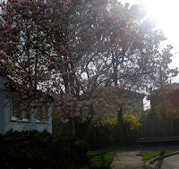
Look around you, the trees have new buds and the flowers are blooming, you're going to be waking up in the morning to the sound of birds chirping and that nice weather you're experiencing is here to stay. What do all those signs point at? They point at the arrival of Spring! I absolutely love Spring, and I always look forward to the arrival of the flowers of the Magnolia tree. They simply put a smile on my face! They make everything seem so beautiful and perfect after a boring grey Canadian winter. Well, this year I didn't experience the typical "harsh Canadian winter". Perhaps that's why I wasn't awaiting the Magnolia trees as usual. Life was just life, on this "normal" Thursday. As usual getting up late in the morning, wishing I could just go back to sleep, jumping into the shower, running off to school, dragging the day out, counting down the seconds, awaiting the bell and then hopping in the car so I could finally get home! Usually I make small talk and /or zone out on the ride home, that day I did both suddenly we had reached the end of my street, but there was something unusual! Then it hit me, at the end of the street there the Magnolia tree covered with lots and lots of beautiful pink flowers! Spring had arrived and so have the beautiful flowers of the Magnolia tree! The flowers are like nature's most perfect design, they're petals come in an organic oval shape, the flowers have lots and lots of petals. The most amazing thing was how every petal appeared the same, but after taking a closer look each petal was unique, each petal curved differently and each had a slightly different colour gradient,
but all together they make the flower look so unified and perfect.( kind of like how all of my friends and I are different; because of the way we think, look and how we are all very different from one another, but together we are like these individual petals uniting to create a beautiful flower) The flowers come naturally in a perfect tone of white, violet and rosy pink. On the weekend I saw Magnolia trees with flowers whiter than snow, and I also saw a yellow Magnolia( kind of unusual), it was beautiful. They're natural beauty have inspired me to take the time and observe nature and all it has to offer. I am incredibly sad that these flowers are only here to stay for a few weeks, but they have impacted me in such an unforgettable way that memory will always stay in my heart. I shall be waiting for my magnolias' long after spring has gone.

I forgot to mention, I took these pictures ! Weird eh, I don't usually take pictures, I guess that Thursday wasn't so normal after all...


Tuesday, April 20, 2010

Siddhagiri Wax Museum


In case you have not seen it before...

Siddhagiri Museum[similar to Madame Tussauds wax museum]


Siddhagiri Museum[similar to Madame Tussauds wax museum]
Siddhagiri Museum is located near Kolhapur city in Maharastra State , India . It has a history of more than 1000 years, and is a holy place of worship of Lord Mahadeva. The surrounding around the museum is very calm and quiet, a hilly place with a good collection of Flora and Fauna.The main objective of the project is to refresh the history of self sufficient village life. There were 12 main profession based casts i.e. professions performed by generation by family members and 18 ALUTEDARS, who provided equipments to all villagers useful in their day-to-day necessities of domestic as well as agricultural life. The first phase of the museum spans over 7 Acres of area with almost 80 main scenes and around 300 wax statues. There is a unique combination of expression, accuracy and liveliness in the whole village. Each sculpture has a multi dimensional effect and lifestyle theme to make a proper visual story.The Museum projects the entire village as a single family, and as single family members in a joint family. No adulteration, no cut throat practice, no mad rat race, no pollution, but caring, and delightful atmosphere, no bitter feeling, but fertile land, clean water, clean air, quality food, maximum use of natural resources, cattle field, livestock, job satisfaction. All these things are reflecting the beauty, joy, satisfaction of human race and one-ness with nature.
Here are some more scenes ..


Love the clarity and color, its so vivid, definitely a place I shall visit in the future.