Black & White Combination
 Gray Scale Combination
Colour Combination
Gray Scale CombinationThe Colour Logo
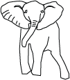
In this logotype I used colour and text. The colour I have chosen is a pink that is a bright,warm and bold colour and at the same time a very traditional Indian colour. The pallet I have used is a little flat, because the outline of the elephant and the colour of the text is the same black, but at the same time the black unites the logo. The lines I have used are very clean, clear and bold, in terms of thickness they are not extremely thick or thin. There are no straight lines all the lines i have used are that of the natural shape of an elephant.
Black and White Logo
The black and white logo works very well. It is very functional it can be large or small, it works well on different surfaces and looks great even on textured objects. In my opinion it is the most practical logo.
Gray scale
The gray scale logo came out very well in my opinion. It uses a contrast of different grays. The heavier parts of the elephant are a darker shade of gray. The grays truly compliment each other and unite very well with the black outline.
Text Logo
My text logo Is very simple, but bold and easy to read. I used two different grays and black. The simple design and colour pallet are so that they can be easily printed, faxed, stamped and spotted. There is emphasis on the letters B, E and G, they are a lager font size then the rest. The letter E is rotated backward and a few shades lighter in colour.
In conclusion my favourite logo is the coloured one, It brings out a very happy, feeling, a sense of excitement and really stands out! The black and white logo is the most practical of them all, it works really well. The gray scale is not as satisfying and the problem with it is that it doesn’t give off that cultural feeling of my company. The text logo works really well on it’s own and with the logo, it is extremely functional and easy to use. Over all I’m quite content with my logo assignment and hope you all like it too. Feel free to leave a comment.

Well I'm just going to take a stab at critiquing my work...
The assignment was to create a rhythm where you could vary the direction, quality, type and position of the lines. In this piece I used lines with a variety of sizes in slightly different directions. I used the same quality of line and kept the same thickness and space. I used the longer lines and shorter lines to creates the illusion of depth. Take a look at the image I created, what do you see ? When I look at it from a bird's eye view, I see a a rope bridge, when looking at it straight on I see a musical beat. When I was creating the piece I was thinking of musical beats, I was inspired by something I saw on a application called Garageband. Overall I'm content with the piece, what I enjoy about it is that everyone who looks at it sees a new perspective of it.


Today I'm critiquing Ruisdael's The Windmill at Wijk on it's Imitational qualities. Some people believe art should look realistic, Ruisdael does an excellent job portraying a real landscape. The waves look as if they are in motion. The Space is used really well, there is no negative space in the painting. The attention to detail in the clouds is great, they look very "real". You can see the puffiness in the clouds and in the log fence you can see texture of the wood. Overall the painting looks quite realistic.
When critiquing it based on Emotionalism qualities, I find that the painting can be both happy and sad. If you look at the choice of colour the colours are very cold, which gives off a sad and unpleasant feeling. But when viewing the whole paining it looks like a peaceful place, I imagine if I was there I would be quit happy and content.
This painting is not very well balanced, the right side is heavier than the left. The windmill is the focal point of the painting and is the most emphasized, it captures one’s attention at once. The colour pallet chosen is mainly on the cool side and there isn’t much contrast. The clouds gradually change from darker to lighter as does the water. Expressive lines are used in the water to create a ripple effect and to show a sense of movement. The sky is larger in proportion to everything else and there is more negative space then positive, I think that it creates a sense of depth. The texture in the clouds, windmill, trees and log fence are all united very well. Formalism is the art of tying the elements and principals together, Ruisdael has a gift of tying them together beautifully to unite his work.